F R E E
R E S O U R C E S
F O R F A M I L I E S
FAMILY DREAM INSTITUTE
ASSETS INCLUDED
> POWERPOINTS
> WEBSITE REDESIGN
> PRINT COLLATERAL
> SOCIAL MEDIA GRAPHICS
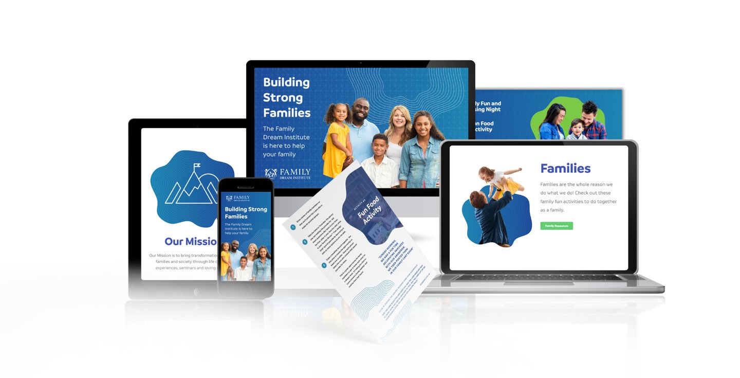
The family dream institute was started as a vision to give families, pastors, and teachers the resources they need to create a culture of blessing. I redesigned the entire website to give it a more modern, and professional feel. The colours were dictated on the previously designed logo, that was already created.

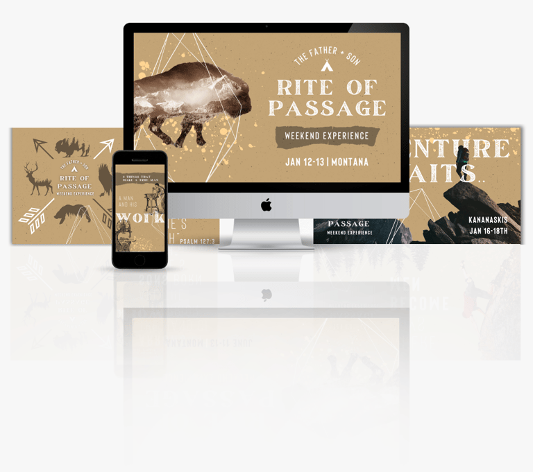
The Rite of Passage is where boys become men and dads become the fathers God has called them to be. the typography gives it a feeling of adventure, and the overall feel is a blend of modern and rustic. Assets included: a brochure, multiple video promos, fb graphics, instagram graphics, fb stories.

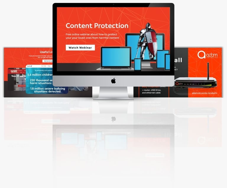
This was advertising a webinar on Content Protection, how to keep yourself and loved ones safe on the internet. I used the knight popping out to symbolize him protecting the digital devices. The colours were brand colours of adamnetworks. Assets included: a web page, downloadable pdf, and fb graphics.
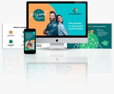
The Personal Communication Plan is all about going on a journey to successful relationships. The feel I wanted to convey was that of playfulness, quirkiness, and fun. Which is what the colours and images reflect. The logo itself is an abstract speech bubble, and is a graphic asset in the designs itself. Assets included: Logo, webpage, multiple video promos, powerpoint, fb stories, fb graphics, and email graphics.

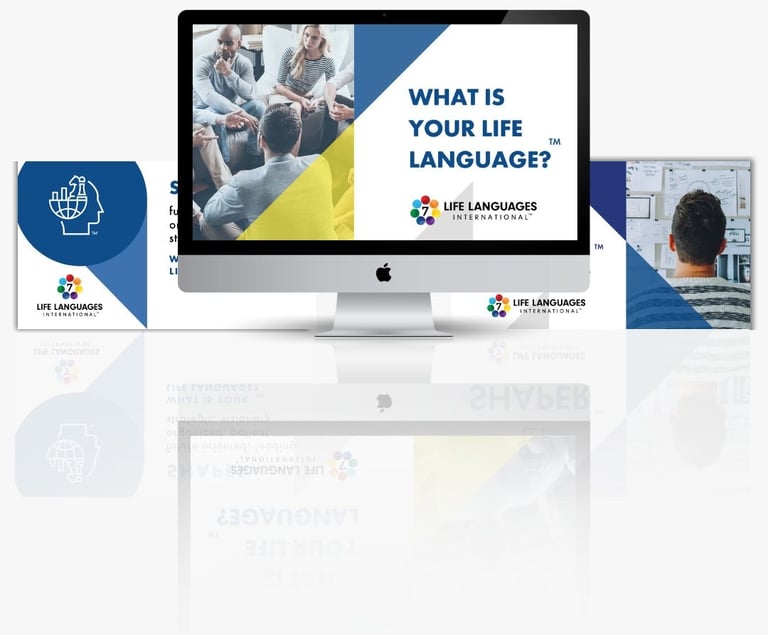
Life languages is basically learning what your communication style is. It is like the seven love languages but for communication. Colours were dictated by the logo itself. Assets included: powerpoint slides, fb graphics, webpage, and email graphics.

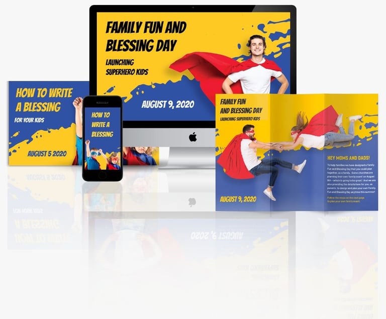
The Family Fun and Blessing Day is all about teaching parents the importance of blessing and the impact it has on their kids. The idea behind the design was using a comic book style font to emphasize the superhero feel. The paint stroke gives a childish feel. Assets included: web banners, web page, brochure, powerpoint, buck-slip, and fb graphics.

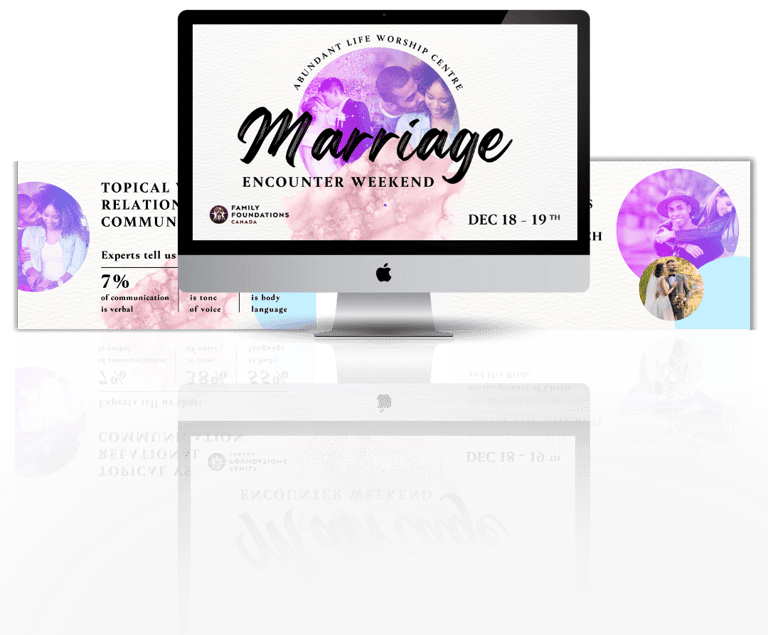
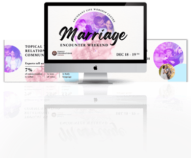
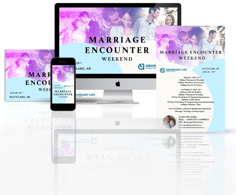
This is the brand package for the Marriage Encounter Weekend.
The idea behind it was having the circles overlapping signifies coming together and intimacy. The collage at the top shows various stages of intimacy in a marriage. The blue and white colors give a feminine feel but still a touch of masculinity. Assets included: fb graphics, fb story, IG graphics, 8.5x5.5" flyer, promo video
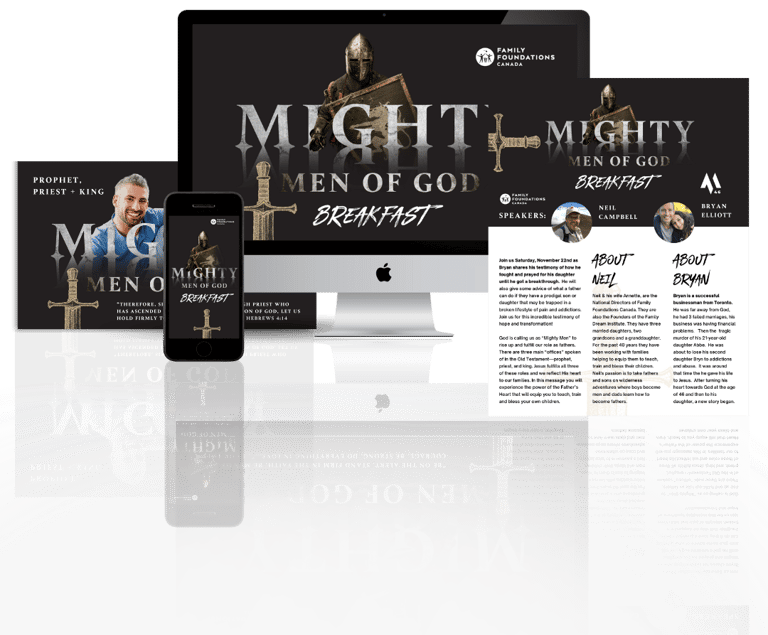
The Mighty Men of God is a men's breakfast that is all about experience the power of the Father’s Heart that will equip you to teach, train and bless your own children. I used a reflection on the 'Mighty' wording to give a feeling of grandeur and power. The crusader is a representation of how we are in a battle. Assets included fb graphic, poster, 8.5x5.5 flyer
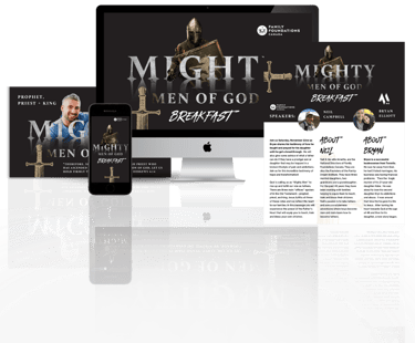
P O W E R P O I N T S
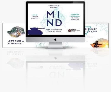
The Battle for The Mind is a webinar dealing with mental health. The main design is focused on an abstract look at neurons in the brain. I chose the colours to give it a medical feel. Assets included: a powerpoint, and fb graphics.

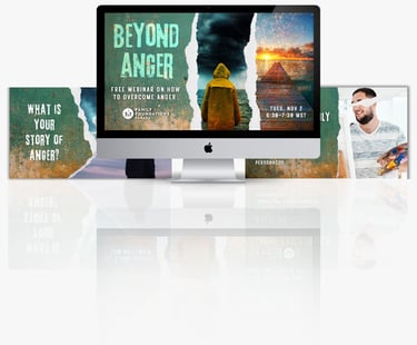
This is a webinar that is dealing on getting to the root of anger. The colours, tears, and typography all give it a frustrated grungy feel. Assets included: ppt and fb graphics.

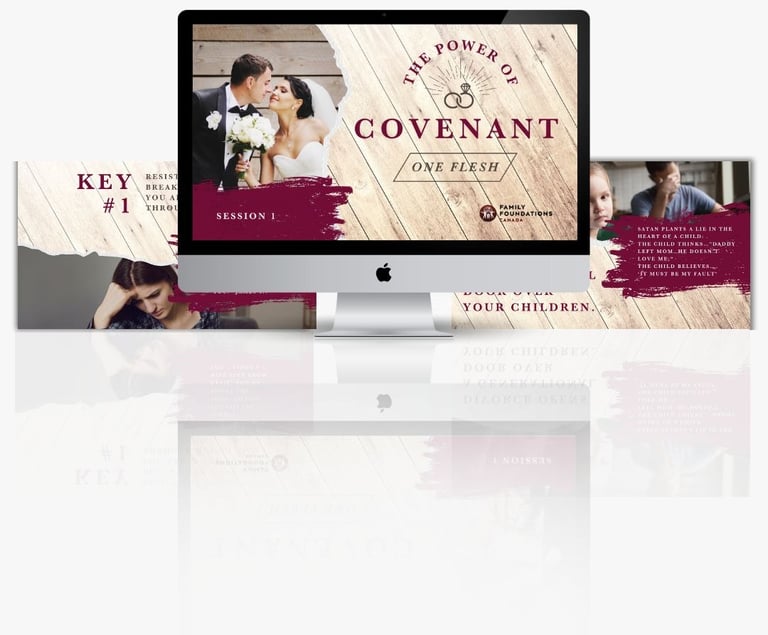
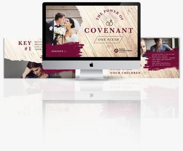
This powerpoint focused on discovering what covenant is and the important it plays in a marriage. I chose the dark red colour to represent passion, and the serif fonts to convey trust.
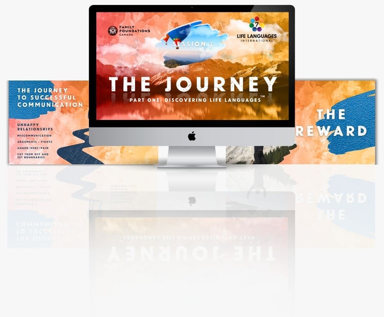
This is a powerpoint going into detail about the life languages. The colours were pulled directly from the logo. the overall feeling I was going for was a sense of discovery.
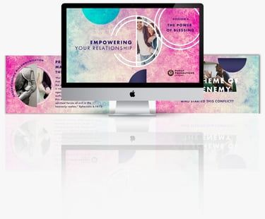
This is a powerpoint that is dealing with getting deeper into the causes for conflict and how to deal with it. It is based on the empowering relationships seminars from FFC. The rings represent connection and relationship and the colours are a mix of blue and pink for men and women.

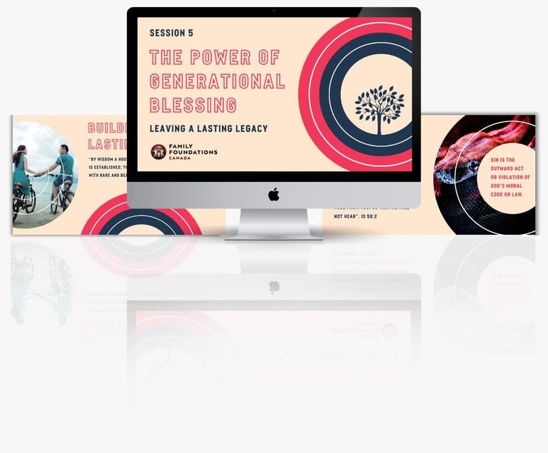
This is all about going deeper into understanding the importance of legacy and generation blessing. I used the rings as abstract tree rings.and the circle again to refer to community, and family.

This is a powerpoint all about cultivating a deeper intimacy in your marriage. I used the gradient color overlay to give a sense of intimacy. I used the script font on the cover to mimic signing a marriage certificate. The design elements give it a feeling of delicacy. I used the serif font to signify a feeling of trustworthiness.
