H E L P
F O R T H E
H O M E L E S S
THE MUSTARD SEED
ASSETS INCLUDED
> SOCIAL MEDIA GRAPHICS
> WEBSITE PAGES
> PRINT COLLATERAL
> SIGNAGE
> LOGO DESIGN
> BRAND DESIGN
> EDITORIAL DESIGN
> INFOGRAPHICS
> CAMPAIGNS
> WEB GRAPHICS
> T-SHIRT DESIGN
The Mustard Seed is a non profit that exists to help the homeless and prevent it in the first place. They have Offices in Calgary, Edmonton, Red Deer, and Kamloops

Democrew is all about breaking down stereotypes people typically have of homeless people, and showing how they are just like us. Groups of teens are organized for a week to get a first hand look into what it is like to be homeless, they get to give them free meals and also learn more about their own relationship with God.
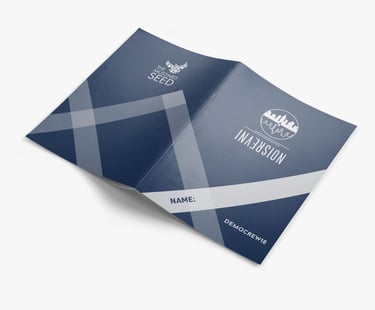
This was a 60 page handbook that they would give the teens that volunteered. The feel I was going for was modern and fresh. and the design elements a reference to The Rec Room.
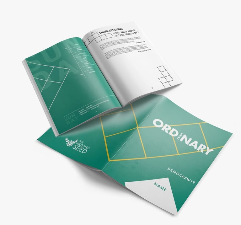
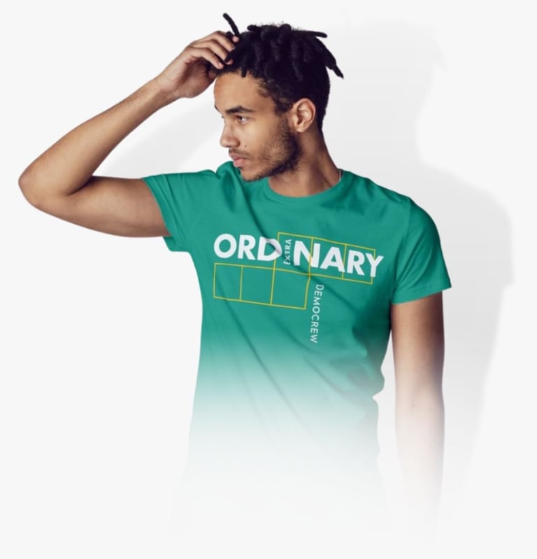
This was the t shirt design that I created, using the logo I designed that year of Ordinary Extraordinary. The brief was to make something that was clean and modern.

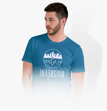
This year was all about “Inversion” on the sermon on the mount and how everything Jesus taught was counter cultural. The logo conveys the ways of Jesus being upside down from the current culture. The brief was to make something clean and modern.

This was a 60 page brochure for both the Calgary and Edmonton office I designed that was the handbook the staff would hand out to the kids.

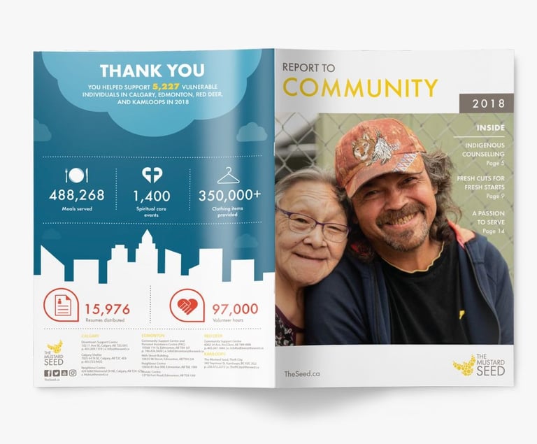
This is the cover to the Report to Community from 2019, it is basically an annual report to what happened at the mustard seed in the past year. The brand feel of TMS was that of modern and clean with a lot of infographics. The Colours used were from the brand colours.

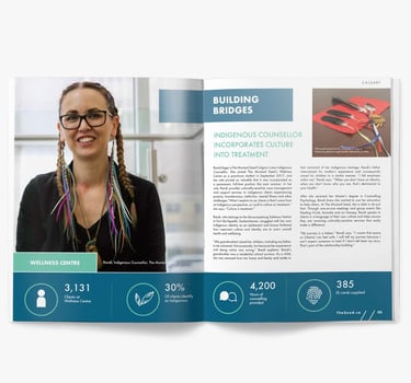
This is a spread from page 3 of the RTC, The rectangle at the top is a metaphor for reaching out to people to build bridges in community and relationship.

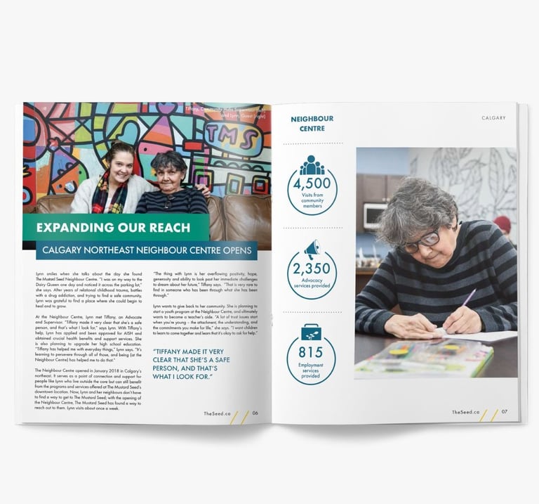
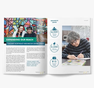
This is a spread all about the neighbour centre in NE Calgary. I used the bars going past the top one to further convey reaching out.
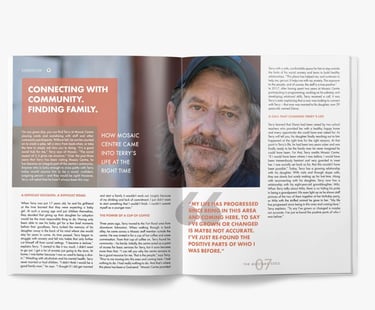
This is a spread from the 2019 Summer Newsletter at TMS, again the photo spans across the page to convey connectedness and reaching out. Colours were based on the mosaic centre sub brand of TMS.

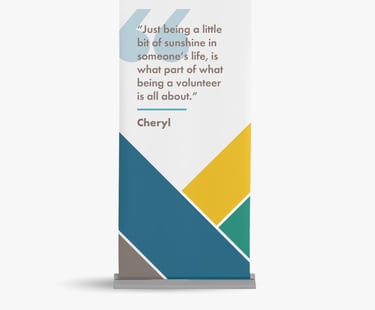
This is part of 3 banners I designed for The Mustard Seed Sorting Centre. The brief was just to create 3 banners that had powerful quotes from past volunteers to motivate future volunteers. The graphics is a representation of coming together.

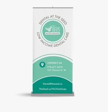
This was a banner for our new locations “at the time” dental office opening up in Kamloops, BC. The graphic represents us joining in their community.

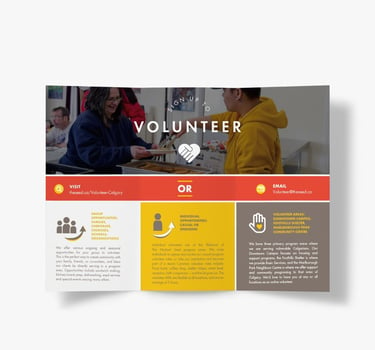
This was a brochure I designed for the Red Deer location that they would give to potential volunteers.

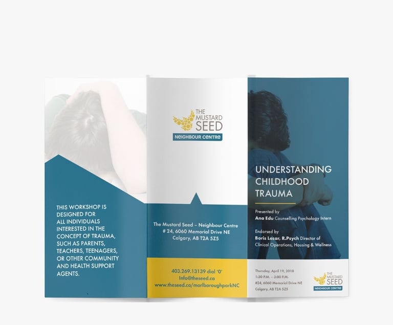
This is a brochure I designed for the neighbour centre, that goes into details about trauma and its effects on kids.
